We were asked to create an audience research questionnaire so that we knew exactly what people would like to see and what they were expecting from our music magazine.
1. How old are you?
2. What gender are you?
3. How often do you buy a music magazine?
4. What genre of music magazines do you buy?
5. What do you like about the type of magazines you buy?
6. What is your favourite indie band/solo artist?
7. How much would you pay for a magazine?
8. Would a free gift make you more intruiged to buy a magazine?
9. What three words would you associate with indie music?
10. What colours would you prefer to see on a music magazine?
11. What kind of regular content do you like to see on the music magazines you buy?
12. What kind of feature articles do you like to see on the music magazines you buy?
Sunday 31 October 2010
Thursday 21 October 2010
Content analysis
In today's lesson we were asked to analyse music magazine contents page's so that we knew exactly what we would have to put in our magazine's when it came to producing them. We were asked to present our work on prezi. I found this simple to use although i had never used it before and it's an effective way to present our work.
http://prezi.com/2dnb3p_5hm0s/music-magazine-contents-analysis/
http://prezi.com/2dnb3p_5hm0s/music-magazine-contents-analysis/
Thursday 14 October 2010
Magazine analysis
In today's lesson we were asked to analyse music magazine front covers. I chose to analyse 'Q' and 'NME' because they both fall into the same genre as the music magazine that i'm going to produce. This is so that i can get a better idea of what my music magazine needs to include.


Tuesday 12 October 2010
Codes and conventions of a double page spread
Today in class we had to bring in and analyse various music magazines in groups, so that we could come up with the codes and conventions of a double page spread.
.jpg)
.jpg)
.jpg)
.jpg)
- A large, short and snappy headline is used so that it stands out and catches the attention of the readers
- A standfirst is used above the article to explain what it's about
- A drop caps is used on the first letter of the article
- The article is written in size 11 font and there's alot of writing on the page
- The article is informal so that it will connect with the audience
- There tends to be 3-4 columns
- There tends to be one main image, usually placed on the left, and takes up a whole page. Although the image may occasionally be on the right, in the centre or bleed across the page
- The colours used throughout the double page spread are consistent, simple and match the theme so it will entise the readers
- The page number is at the bottom right hand corner of the page and usually has the name of the magazine next to it and occasionally the date
- On the double page spread there's credits to the photographer and the writer
- Throughout the article are exciting and controversial drop quotes to attract the readers into reading the article as the drop quotes are the first thing people will read
Initial Plans
After researching magazines that fit my genre I have decided on the plans for my music magazine
- Price: £2.30
- Frequency of publication: Fortnightly
- Average issue size: 88 pages
Monday 11 October 2010
Researching the market place
NME
Price: £2.10
Frequency of publication: weekly
Issue size: 58-82 pages
Regualr content: Band index
Feature articles:
www.nme.com/magazine
www.ipcmedia.com/

Q
Price: £3.90
Frequency of publication: monthly
Issue size:
Regualr content:
Feature articles:
http://www.qthemusic.com/
www.bauemedia.co.uk/

Kerrang
Price: £2.10
Frequency of publication: monthly
Issue size: 63 pages
Regular content:
Feature articles:
www.kerrang.com/
www.bauemedia.co.uk/
Initial ideas
I have decided that after researching magazines such as "Q" and "NME" the genre i am going to use for my music magazine will be indie. This is because it seems to reach a wider target audience.
The target audience for my music magazine will be teens to early adults who enjoy listening to indie music.
The target audience for my music magazine will be teens to early adults who enjoy listening to indie music.
Evaluation of school magazine
For our preliminary exercise we had to plan and create a front cover and contents page for a school magazine. I tried to make sure that my school magazine followed the codes and conventions, to do this i researched other magazines to find out what these were. After getting ideas from magazines from the same genre for example Weather Report I was able to see what my magazine would have to include and I could then go on to planning and creating my own.
When planning my school magazine, the first thing I had to do was come up with a name for the magazine, I came up with the name 'Class Time' because the codes and conventions of a front cover suggest that the title of the magazine should fit in well with the genre. I placed the masthead of my magazine across the top of the page and used a bold, unique font which follows the codes and conventions. I used a picture text cohesion on the front cover of my magazine, the colours I used match the colours used in the central image. The main coverline goes with the central image, it's in a bigger font than the other coverlines and all coverlines are in the same font. I also used a puff to premote a free gift so that it attracted more readers. However, although i followed alot of the codes and conventions there were a few that i didn't follow. I didn't used any of pictures on the front cover and although the central image does take up alot of the page i think i could have made it a little bigger so that there was less white space on the page, however i did make sure that my central image used a direct mode of adress so that the reader felt involved.
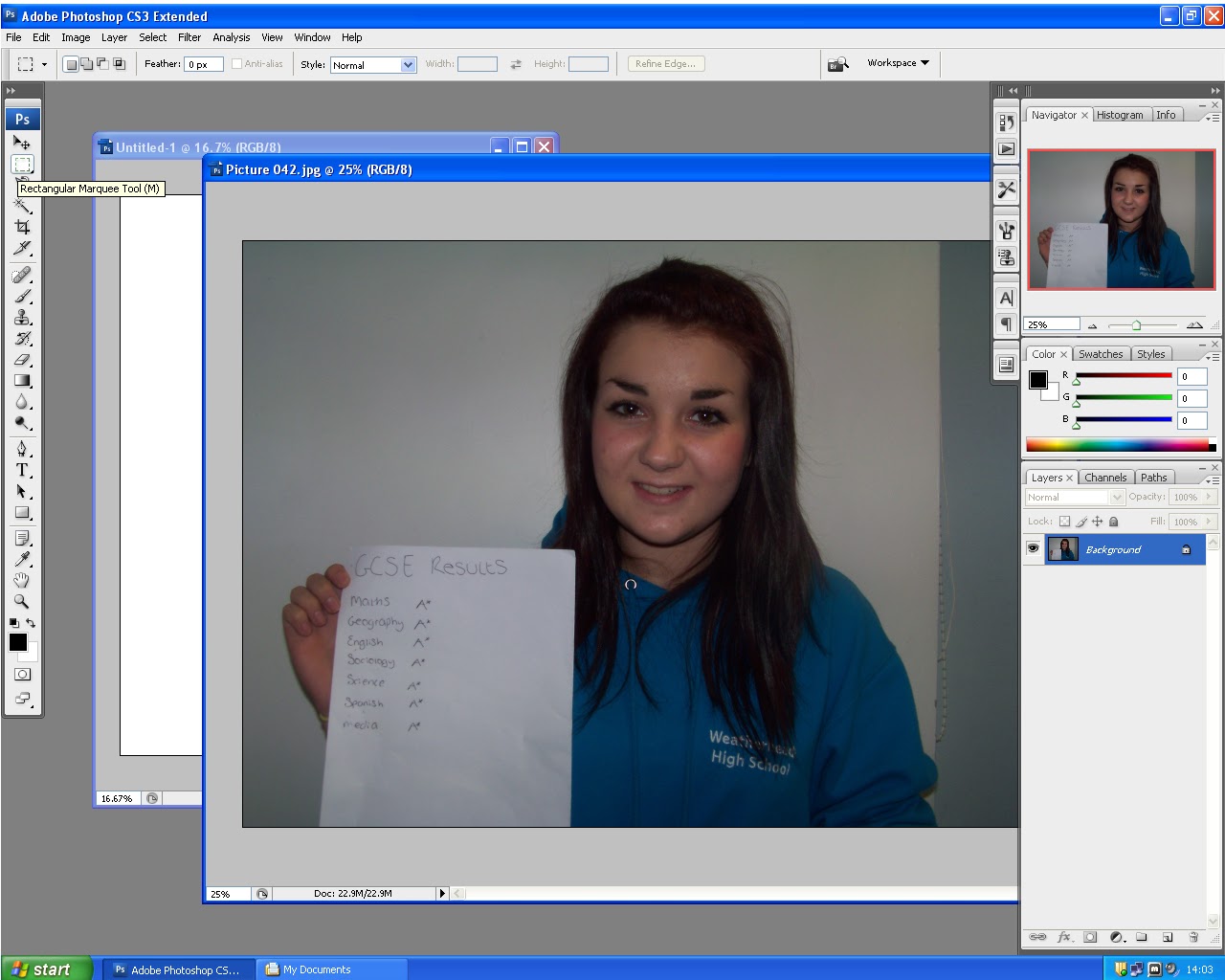
When creating the front cover for my school magazine I used Adobe Photoshop. I found this easy to use as I had used it before, the layout was simple and easy to follow which made making my front cover alot quicker to create than I thought it would. Photoshop is a very effective programme to make the front cover look professional, it's simple to edit images, text and colours.
After i had finished my front cover I started to create my contents page. I made sure that the contents page would follow most of the codes and conventions of any other contents page, particulary ones of this genre. For example, I made sure all the feature articles and regular contents were in the same font and the same size, the page numbers were in a different colour. Also, I used the words 'Contents Page' in the top left hand corner, this is so that it's clear what you're reading as the top left hand corner is the first thing people will read. I followed all of the other codes and conventions of a contents page other than; repeating the masthead on the contents page, using captions underneath the images and repeating the date and issue number again.
To create the contents page i used a programme called QuarkXPress. This was more effective to use for a contents page rather than Photoshop, as it has guidelines for the columns. At first i found it hard to use, but this was because i'd never used it before. Once i got the hang of how to use it i found it quite simple and was able to create my contents page quickly.
In conclusion, I managed to follow alot of the codes and conventions of a magazine front cover and contents page. I was able to create them quickly once I understood how to use the programmes. However, if I were to do this task again i would spend more time on the planning as my final products were not the exact same as i had planned them. I will take this into consideration when planning my main task so that this doesn't happen again.
When planning my school magazine, the first thing I had to do was come up with a name for the magazine, I came up with the name 'Class Time' because the codes and conventions of a front cover suggest that the title of the magazine should fit in well with the genre. I placed the masthead of my magazine across the top of the page and used a bold, unique font which follows the codes and conventions. I used a picture text cohesion on the front cover of my magazine, the colours I used match the colours used in the central image. The main coverline goes with the central image, it's in a bigger font than the other coverlines and all coverlines are in the same font. I also used a puff to premote a free gift so that it attracted more readers. However, although i followed alot of the codes and conventions there were a few that i didn't follow. I didn't used any of pictures on the front cover and although the central image does take up alot of the page i think i could have made it a little bigger so that there was less white space on the page, however i did make sure that my central image used a direct mode of adress so that the reader felt involved.
When creating the front cover for my school magazine I used Adobe Photoshop. I found this easy to use as I had used it before, the layout was simple and easy to follow which made making my front cover alot quicker to create than I thought it would. Photoshop is a very effective programme to make the front cover look professional, it's simple to edit images, text and colours.
After i had finished my front cover I started to create my contents page. I made sure that the contents page would follow most of the codes and conventions of any other contents page, particulary ones of this genre. For example, I made sure all the feature articles and regular contents were in the same font and the same size, the page numbers were in a different colour. Also, I used the words 'Contents Page' in the top left hand corner, this is so that it's clear what you're reading as the top left hand corner is the first thing people will read. I followed all of the other codes and conventions of a contents page other than; repeating the masthead on the contents page, using captions underneath the images and repeating the date and issue number again.
To create the contents page i used a programme called QuarkXPress. This was more effective to use for a contents page rather than Photoshop, as it has guidelines for the columns. At first i found it hard to use, but this was because i'd never used it before. Once i got the hang of how to use it i found it quite simple and was able to create my contents page quickly.
In conclusion, I managed to follow alot of the codes and conventions of a magazine front cover and contents page. I was able to create them quickly once I understood how to use the programmes. However, if I were to do this task again i would spend more time on the planning as my final products were not the exact same as i had planned them. I will take this into consideration when planning my main task so that this doesn't happen again.


Sunday 10 October 2010


Tuesday 5 October 2010
Photo's for magazine front cover and contents page


The fist image is going to be used as the central image for the front cover of my school magazine. The other four images are going to be used for the contents page.
Subscribe to:
Posts (Atom)